Need Insights into the 2023 Leasing Market? READ HERE
We’re doing something completely different with this week’s ShowMojo Newsletter. We have gobs of rental data in ShowMojo. We’re seeing a couple of major trends breaking. We feel compelled to share.
The White Hot Rental Market Is Over
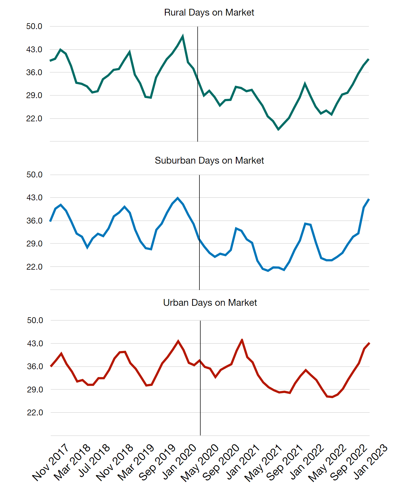
Our data shines a bright light on anecdotal statements we’ve been hearing since August. You can no longer slap an eye-popping rent amount on the door and expect six applications. Most readers likely already know this. And, of course, there are always some locales that might be an exception. But, in general, nation-wide, the applicants-without-effort party is over.
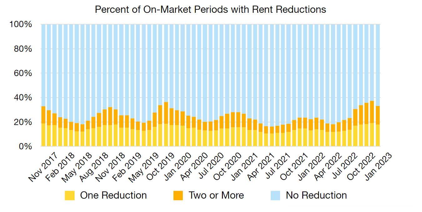
At the very least, the average days-on-market is back to historical norms for snowboarding season. In some cases, it is potentially higher than historical norms (check out the graphs). This quick snap back to normalcy took lots of people by surprise. We’re seeing a higher ratio of rent reductions in the last few months than we’ve seen any time in the last five years. (We really wish our data went back further, but that’s all we’ve got for now folks.)
 More companies are laying off workers, yanking workers back into the office, or both. Yes, the job market is still stupid keep-your-hands-away-from-the-stove hot, but can that really hold? Looking at these charts, our assessment is that 2023 will be the year that the rental housing market slides back to boring normal. That means all manner of leasing best practices (that just happen to be automated into ShowMojo, by the way) are going to become pretty critical for anyone who wants to continue to be the master of their market times.
The Rural and Suburban Pandemic Advantage Is Gone
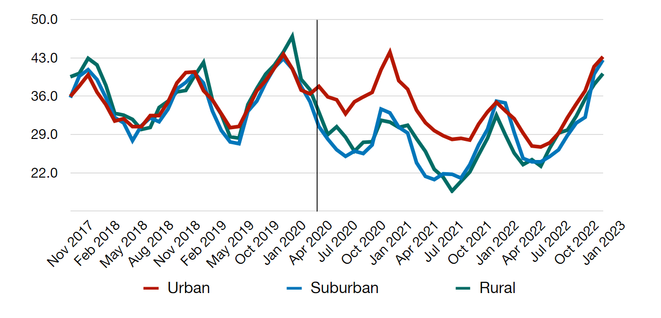
Look what happens when we mash the urban, suburban and rural market times into one single graph. This graph starkly illustrates the pandemic-born bifurcation between non-urban and urban market times. You can see them pull apart in March, 2020. However, as early as July, 2022, they were tracking back together. This fits with the overall sense that the US population has moved past the pandemic. Rural and suburban housing no longer holds a pandemic advantage. If the job market starts to shift, and workers get pulled back into the office in increasing numbers, what are the chances we could see a temporary bifurcation the other way? This one is pure speculation, but a pendulum doesn’t normally swing to only one side.
Where’s This Data Coming From?
The data and graphs here come from more than half a million successful residential leases facilitated through ShowMojo. That’s nationwide activity across all housing types and broken down by urban, suburban and rural zip codes.
Did you find this interesting? We certainly did. Watch these newsletters for even deeper insights in the coming months.
Still Not a ShowMojo Customer?
What data do you need to hop off the fence and join the Leasing Automation revolution? Let us know.
Get Leasing Automation tips and solutions right to your inbox.
