
The ShowMojo Showing Card Redesign Becomes Permanent Soon
If you’ve spent much time in ShowMojo reviewing showings, you know it can take a fair amount of clicking through to review prospects and check screening answers.
So we rolled out a newly designed, consolidated Showing Card to save your clicks.
That was back in June. At the time, we said you could roll the change back for 3 months. But in a handful of weeks, the 3 months are up, and the change becomes permanent.
A Refresh on What’s New with the Showing Card
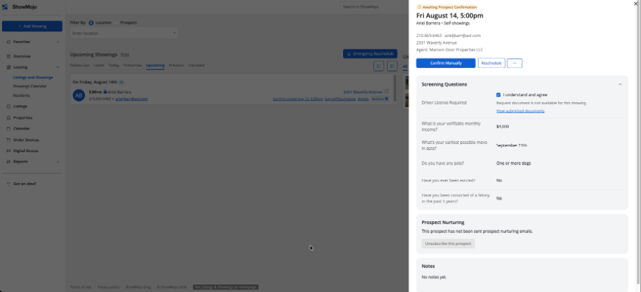
The Showing Card has been fully redesigned around a clean side panel layout.
Instead of pulling you into a separate popup, the panel opens alongside your showings list. The list stays visible the entire time you’re reviewing a prospect, so it’s easier to navigate from one prospect to the next.
Inside the panel, everything you need is organized in one place:
- Prospect info, front and center.
- Screening questionnaire answers in their own section.
- Required next steps.
- Editable fields that only appear when you actually need them, so the view stays clean instead of overwhelming.
Here’s what the side panel looks like:
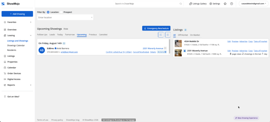
And that side panel appears after you click on one of the showings in your Upcoming Showings list.
What This Means Day to Day
This is the kind of change that’s hard to appreciate from a description — but once you’re moving through showings with the list still visible the whole time, you’ll never want to go back.
This is live now for every account. If your team needs more time to adjust, the previous Showing Card view is available to switch back to for about one more month.
Ready to see it in action? Log in and open any showing — the new panel is already there.
Not a customer? Schedule a demo.
Get Leasing Automation tips and solutions right to your inbox.